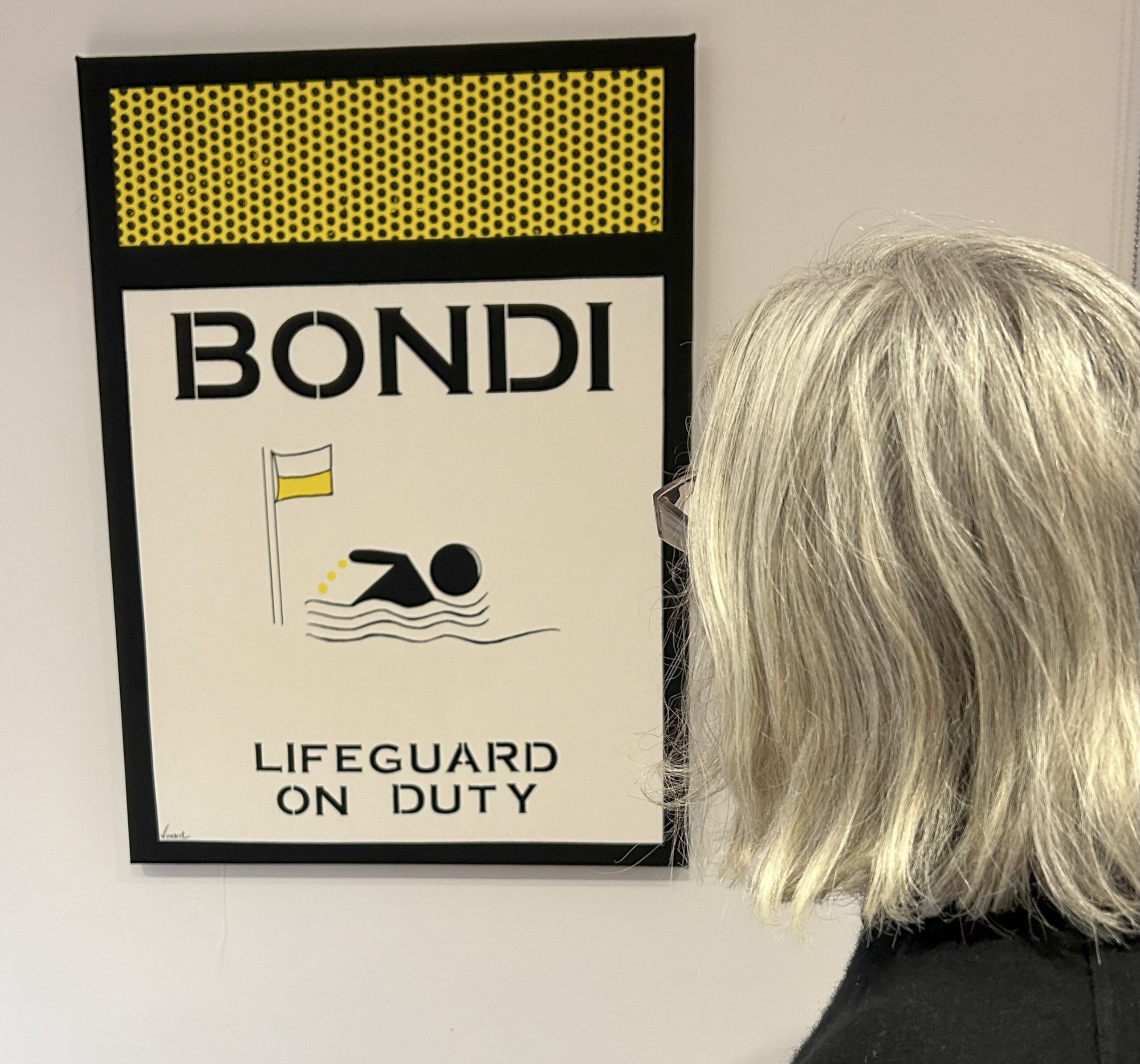
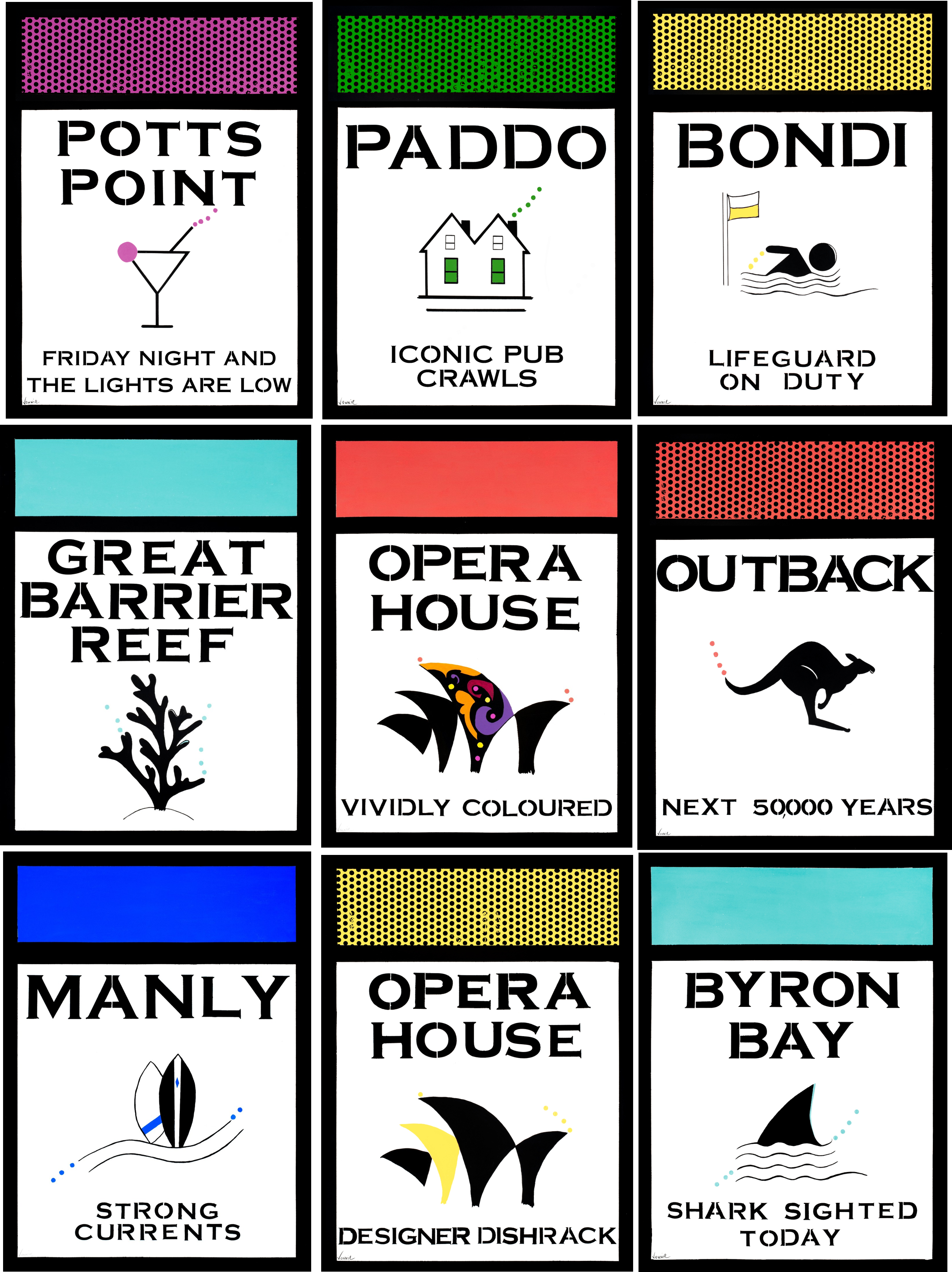
Introducing the Colour Palette
Vonnie Pop Studio: Colour is central to my work—more than just a visual element, it becomes the subject itself. Each piece is crafted with a deliberate palette, often paired with reflections on the origins or emotional weight of the colours used. You Can Feel Colour – We constantly interact with colours, often forming strong associations and emotional responses to them.
Moreover, six colours shape my work. Two shade of blue, blue frequently represents natural elements such as rivers, the ocean, and the sky. Yellow conveys joy, radiating a sunny, optimistic energy. I like the darker shades of pink, cerise and fuchsia, which can convey passion, and confidence. Green can represent nature, growth or regeneration. Orange has always followed me, I particularly like Vermillion Orange—it’s a colour that symbolizes warmth, radiance, and the richness of a harvest sunset. It’s also the only colour in my logo, which was thoughtfully designed by @lisasanasiceramics.
Orders and Commissions
Let’s make your home look fabulous
LIMITED EDITION CANVAS – $595
- 100% Hemp and Cotton Stretched Canvas – 56 x 76cm
- Numbered and ready to hang
POSTER – FINE ART TEXTURED PAPER – $225
- 100% Cotton Giclee Paper Museum Grade – 56 x 76cm
- Unframed